Visualizing Signal Flow in Neural Network Model
Recently I have been teaching myself how to model signal flow in artificial neural networks using R. My personal goal is to understand how proteins in cells and neurons in the brain process information. I am focusing on multilayer perceptrons at the moment.
In general terms, when I talk of understanding “signaling”, I mean trying to figure out how a given system, thought of in terms of a connected network of component parts, receives a signal, processes it into information, and uses that information to make some kind of decision.
So I go online and find models of cell signaling or neural signaling. These are typically dynamic systems with rate parameters stored in some kind of computer readable markdown language like SBML:
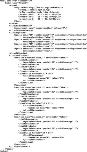
This code contains the math and everything else needed to describe the model. Often times you can even use it to create a visualization called a Petri net. Petri nets are a type of bipartite graph that describes the system in terms of “places” and “transitions”. A “place” is a possible state for a component in the system. At a given point in time, the permutation of places across all the components gives the current state of the system. A “transition” is a possible change from one set of places to another, in other words all the ways the system can reach a new state in the next time instant.
Engineers love Petri nets for studying complex systems. But the problem with using them to study signaling is that is not at all clear how signal flows through the system. A signaling pathway is like a circuit. So I want something that shows me flow through a circuit, like: Source –> A –> B –> Response. Unless you are some kind of savant, you can’t just see that signal flow in the XML, a set of mathematical equations, or in a Petri net graph.
I want the following workflow:
- Download a computational model from Github or wherever.
- Run a script on the XML or whichever markup language file.
- Generate a “wire diagram”, that shows how signal flows from source to response.
And I want to do it with R.
Turns out this is possible with some basic matrix operations. So I did it on a simple multi-layer perceptron I made. I call it “Hot Potato”.
“Why should I care?”
This is good for anyone looking to build intuition about how artificial neural networks (and signaling networks in general) process information.
Hot Potato
This toy model represents part of the European potato industry. It is composed of subpopulations of players in the industry; farmers who pick the potatoes, sellers who retail them, cooks who prepare them in restaurants, and diners who eat them. The industry model covers both England and France. Like the game hot potato, the potato is passed along between the various agents in the industry.
Here are the particulars of the model:
- Farmers pass potatoes to sellers, sellers to cooks, cooks to diners.
- Farmers, sellers, and cooks are split by two nationalities: French and English. The rate of potato passing from one agent population to another depends on the nationalities of both parties.
- Diners, regardless of nationality, all eat the potatoes at the same rate.
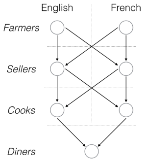
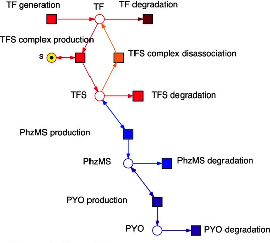
And of course this is structure of a multi-layer perceptron, a common signaling network structure in the brain and in cells.
Visualizing the “signal flow” here is easy. The “signal” occurs when the farmers find some potatoes to harvest. It is based down to the diners, who upon receipt, proceed to eat.
This is what I want to see when grabbing some model off the Internet, not a bunch of math or code. I want to look at the signal flow, and see, for example, if it looks like a multi-layer perceptron or some other signaling motif.
In the following, I work to recover this multi-layer perceptron motif from model math alone.
Starting from equations only
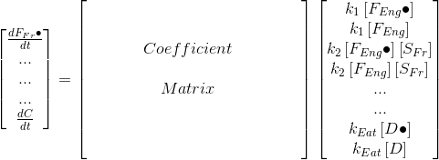
Imagine all I have is the following differential equation representation of this system:
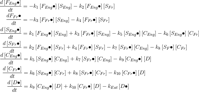
F, S, C, and D are farmers, sellers, cooks, and diners respectively, the “k’s” are rate parameters. The “dot” means having a potato, no dot means not having a potato. The square brackets indicate amount, these left hand side of the 7 equations refers to the rate of change in the amount of potato holders for each population. There are another 7 not-pictured equations for the rate of change in the amount of non-potato holders; these are the same as the above equations except the signs on the rate parameters are reversed.
From this I want to get to the nice graph above, using only code.
Get it to matrix form
The first task it to convert the system to matrix form, like this:
Once I have that, I can apply operations to this matrix to get the results I am looking for.
I wrote code for generating a matrix based on the rules of this system. It is long, uses regular expressions, and a bunch of R-specific syntax, so I display it here. But it is available on the source for this post as well as in a Gist. Here is the output:
##            F.eng->S.eng F.eng->S.fr F.fr->S.eng F.fr->S.fr S.eng->C.eng
## F.eng.has            -1          -1           0          0            0
## F.eng.none            1           1           0          0            0
## F.fr.has              0           0          -1         -1            0
## F.fr.none             0           0           1          1            0
## S.eng.has             1           0           1          0           -1
## S.eng.none           -1           0          -1          0            1
## S.fr.has              0           1           0          1            0
## S.fr.none             0          -1           0         -1            0
## C.eng.has             0           0           0          0            1
## C.eng.none            0           0           0          0           -1
## C.fr.has              0           0           0          0            0
## C.fr.none             0           0           0          0            0
## D.has                 0           0           0          0            0
## D.none                0           0           0          0            0
##            S.eng->C.fr S.fr->C.eng S.fr->C.fr C.eng->D C.fr->D D.eats
## F.eng.has            0           0          0        0       0      0
## F.eng.none           0           0          0        0       0      0
## F.fr.has             0           0          0        0       0      0
## F.fr.none            0           0          0        0       0      0
## S.eng.has           -1           0          0        0       0      0
## S.eng.none           1           0          0        0       0      0
## S.fr.has             0          -1         -1        0       0      0
## S.fr.none            0           1          1        0       0      0
## C.eng.has            0           1          0       -1       0      0
## C.eng.none           0          -1          0        1       0      0
## C.fr.has             1           0          1        0      -1      0
## C.fr.none           -1           0         -1        0       1      0
## D.has                0           0          0        1       1     -1
## D.none               0           0          0       -1      -1      1
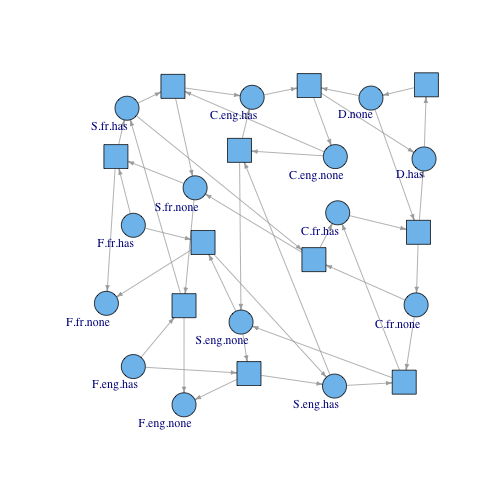
Petri Net Graph
The above matrix maps the left hand side of the equation to the rate laws on the right side. We can use Petri net languages to call the variables on the right hand side “places” and the rate laws “transitions”. The matrix is called an incidence matrix, defined as a matrix that represents the relationships between places and transitions.
The incidence matrix can be converted to a Petri net graph: I use the igraph package to draw the graph. Circles are states (labeled) and squares are transitions (unlabeled so things don’t get too cluttered). Again, check the source for the igraph code.
Invariant analysis
The trick to plotting signal flow is invariant analysis. Invariant analysis basically means finding the null space of the incidence matrix and its transpose.
The null space on the incidence matrix allows you to identify sets of places that who, when their amounts are added together at any time, have a constant total. These sets of places are called place invariants or p-invariants. In this example, no matter how many French farmers have potatoes and how many do not, the total of French farmers is always the same, and thus they form a p-invariant.
And that is obvious of course, because in this example it is meant to be so, but in most real examples p-invariants don’t just jump out at you. In protein signaling, a p-invariant might contain several forms of the same protein, all with uninformative biology names, while some other forms of that same protein might NOT be part of the p-invariant for some reason.
The p-invariants are found by taking non-zero elements from vectors in the null space. Depending on how the null space algo you use works, you can get redundancy in the vectors that needs to be simplified to find “minimal” p-invariants, meaning p-invariants that are not just combinations of other p-invariants. I wrote the following code for finding minimal p-invariants, but it is a bit hacky (I used for loops in R. Blasphemy.):
getMinimalPInvariants <- function(S){
  # Get the places corresponding to minimal p invariants of an incidence matrix
  # S is an incidence matrix with rows corresponding to places and columns to transitions
  # Returns a list where each element is a pInvariant containing an array of place names
  require(MASS, quietly = T)
  nullMat <- round(Null(S), 4)
  rownames(nullMat) <- rownames(S)
  invariants <- list()
  for(j in 1:ncol(nullMat)){
    pVec <- nullMat[, j]
    valCounts <- table(pVec)
    valCounts <- valCounts[valCounts != 1]
    valCounts <- valCounts[names(valCounts) != 0]
    for(i in 1:length(valCounts)){
      val <- valCounts[i]
      invariants <- c(invariants, list(names(pVec[pVec == names(val)])))
    }
  }
  lengths <- sapply(invariants, length)
  invariants <- invariants[order(lengths)]
  if(length(invariants) > 1){
    for(i in 1:(length(invariants) - 1)){
      for(j in (i+1):length(invariants)){
        invariants[[j]] <- setdiff(invariants[[j]], invariants[[i]])
      }
    }
  }
  invariants <- invariants[which(sapply(invariants, length) > 0)]
  invariants
}
pInvariants <- getMinimalPInvariants(S)
Here is what the list of p-invariants looks like.
## [[1]]
## [1] "F.fr.has"  "F.fr.none"
##
## [[2]]
## [1] "S.eng.has"  "S.eng.none"
##
## [[3]]
## [1] "F.eng.has"  "F.eng.none"
##
## [[4]]
## [1] "S.fr.has"  "S.fr.none"
##
## [[5]]
## [1] "C.eng.has"  "C.eng.none"
##
## [[6]]
## [1] "C.fr.has"  "C.fr.none"
##
## [[7]]
## [1] "D.has"  "D.none"
Visualizing them back on the graph:
pVertex <- lapply(pInvariants, function(p){
  V(g)[V(g)$name %in% p]
  })
plot.igraph(g, layout=layout.matrix, vertex.label.dist=-.67,
            edge.arrow.size=.4, mark.groups=pVertex)
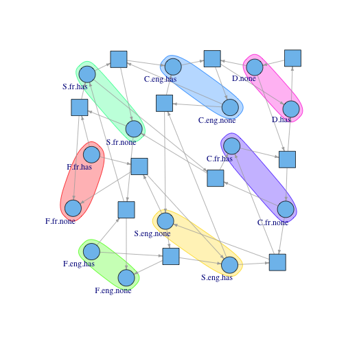 So it works! The algorithm detects states belonging to the same subpopulation just from the matrix structure alone. If it will work here, it will work in complicated cases. These p-invariants will be the nodes in the signal flow graph, so let me give these nodes their rightful names:
names(pInvariants) <- unlist(lapply(pInvariants, function(p){
  gsub(".has", "", p[1])
}))
pInvariants

## $F.fr
## [1] "F.fr.has"  "F.fr.none"
##
## $S.eng
## [1] "S.eng.has"  "S.eng.none"
##
## $F.eng
## [1] "F.eng.has"  "F.eng.none"
##
## $S.fr
## [1] "S.fr.has"  "S.fr.none"
##
## $C.eng
## [1] "C.eng.has"  "C.eng.none"
##
## $C.fr
## [1] "C.fr.has"  "C.fr.none"
##
## $D
## [1] "D.has"  "D.none"
The signal flow graph will have the p-invariants as nodes, and the edges are drawn simply by starting with the source node (F.fr.has) and following along the edges of the Petri net graph. Each time you hit a place in a new p-invariant, you add that p-invariant node to the ordering in the signal flow graph.
You also add edges between p-invariants that overlap. The following code checks for overlap, though it won’t find any in this example. However, if there were such overlapping p-invariants, I’d draw an edge between them and determine directionality based on which of them I hit first while walking along the edges of the Petri net model.
edgeMat <- NULL
# Iterate through and draw edges between invariants where there are shared places.
edgeMat <- rbind(edgeMat, do.call("rbind", combn(pInvariants, 2, function(pair){
  if(length(intersect(pair[[1]], pair[[2]])) > 0){
    list(names(pair))
  } else {
    list(NULL)
  }
})))
The final step is to add edges between p-invariant nodes in cases where there are transitions connecting the places they contain.
#Connect p-invariants by transitions that link their members
edgelist <- get.edgelist(g)
pre.edges <- edgelist[1:(nrow(edgelist)/2), ] #the first half of edges are outgoing from states
pre.list <- split(pre.edges[,1], as.factor(pre.edges[, 2]))
post.edges <- edgelist[((nrow(edgelist)/2) + 1):nrow(edgelist), ]
post.list <- split(post.edges[, 2], as.factor(post.edges[, 1]))
edgeMat <- rbind(edgeMat, do.call("rbind", combn(pInvariants, 2, function(pair){
  paired <- FALSE
  for(transition in transitions){
    if(any(pair[[1]] %in% pre.list[[transition]]) && any(pair[[2]] %in% post.list[[transition]])){
      paired <- TRUE
      break
    } else if(any(pair[[1]] %in% post.list[[transition]]) && any(pair[[2]] %in% pre.list[[transition]])) {
      paired <- TRUE
      break
    }
  }
  if(paired){
    return(list(names(pair)))
  }
  else{
    return(list(NULL))
  }
})))
plot.igraph(graph.edgelist(edgeMat), vertex.label.dist=-1.5, edge.arrow.size=.4)
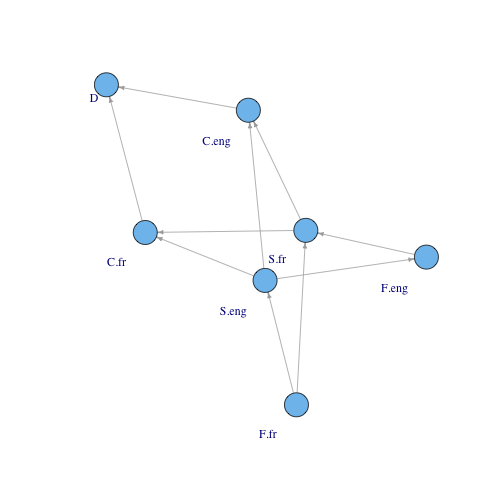
So it is working. In a future post, I’ll run this analysis on an actual signaling model.